

Welcome back to Elite Evaluations, an ongoing series in which I review the Elite Four from each generation of games in the Pokemon series, with an especial focus on costume and character design. Previous entries can be found here.
This time, we’re looking at the Elite Four of the Kalos region, featured in the 2013 games X and Y (commonly referred to as part of ‘Generation VI’.) The header image is from Comic Vine, and all other sources are cited throughout.
Like the Unova Elite Four before them, the members of the Kalos Elite Four can be fought in any order. The Kalos region is inspired by real-life landmarks in France, and combines more modern and technologically-advanced areas with a very strong medieval fantasy vibe. We’ll see both of these influences in the costumes and character design of the Kalos Elite Four, whom the player battles in a building heavily inspired by Notre Dame in Paris.

The Kalos Elite Four also marks a return to the art style of Ken Sugimori, who returned as human character designer for X and Y after Yusuke Ohmura’s stellar turn in Generation V. As with many Sugimori designs, the Kalos Elite Four are – for the most part – not inspired by particular eras or concepts in fashion, though this particular group of trainers has a surprising amount of visual flair not always present in his other designs.
Malva

Malva has a rather unusual backstory for an Elite Four member. As far as everyone is aware, she’s the main (and only) news anchor on the Holo-Caster, the Kalos region’s virtual communicator. But she’s also secretly a member of the villainous Team Flare, whose leader Lysandre invented the Holo-Caster itself.

While this twist presents many intriguing possibilities, the game doesn’t really take advantage of them. Malva could’ve intentionally spread misleading information on Team Flare’s behalf, or even manipulated news to misguide the player. The Pokemon series is notorious for sidestepping potentially interesting plotlines, but this is a particularly egregious example. By the time the player reaches the Elite Four, Lysandre has been defeated and Team Flare has been disbanded, but Malva still expresses animosity towards the player that they foiled Lysandre’s plans.
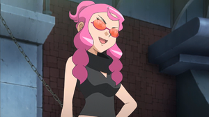
Thankfully, there’s still plenty to discuss with regards to Malva’s outfit. Malva specializes in Fire-type Pokemon, so her black, red and pink colour scheme makes sense. (Red and black are also Team Flare’s signature colours, which makes the reveal that she’s one of its members not particularly surprising.) Malva’s two-piece outfit includes a black, partially backless crop top with a cowl-neck collar; long, skinny red-and-black striped pants with diamond-shaped cutouts running down her legs; and oval-shaped red-tinted lenses.
Malva wears this outfit both in her role as a newscaster and as a secret member of Team Flare, and this duality is a key part of her look. As a reporter, Malva is always seen sitting at a desk, so the top half of her outfit is intentionally unassuming – apart from the enormous collar, which ties into Team Flare’s emphasis on aesthetics. She also wears an ordinary pair of glasses, as opposed to her trademark lenses.
Other prominent female members of Team Flare have outfits largely inspired by mid-to-late 1960s mod fashion. (I covered the fundamentals of mod clothing in a previous column.) Malva, on the other hand, takes inspiration from later decades – namely, the 1970s and 1990s. Her two-piece outfit is Studio 54-ready – especially the pants – and her shoes and cowl-neck top tie into the Seventies aesthetic.

The other prominent aspect of Malva’s look, her tinted glasses, are straight out of 1990s style. Oval frames became incredibly popular in Nineties fashion. Tinted lenses first became popular in the 1970s, but small, oval lenses were a Nineties staple. This combination of 70s and 90s elements doesn’t clash, because the elements from the former decade informed the latter. The unusual details in Malva’s outfit, including the diamond cut-outs and the lack of a top frame on her glasses, make the look edgier and more editorial in nature, rather than historical cosplay.
Malva’s outfit smartly incorporates narrative and character details. It’s memorable, high-impact, and honestly quite daring for this particular franchise. If you’d told me back in the early days of the Pokemon series that a prominent character would be wearing this look, 20 years later, I probably would have been skeptical. (That said, we’ve arguably been building up to this moment since Karen’s outfit in HeartGold and SoulSilver, back in 2009.)
It’s fascinating to see Ken Sugimori and the Pokemon character designers explore these sorts of styles and approaches, and we’ll see some of that same adventurousness in generations to come.
Rating: 5 out of 5.
Wikstrom

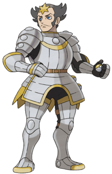
We can’t possibly be expected to take Wikstrom seriously. Wikstrom wears a comically elaborate, very uncomfortable-looking full suit of armour, topped off by a weird bronze star (maybe flower?) in the middle of his forehead. Even his English name is unwieldy; possibly a reference to the genus Wikstroemia, related to the shrub gampi (the potential inspiration for his Japanese name).
In case the armour didn’t tip you off, Wikstrom specializes in Steel-type Pokemon – and that’s about as much as we know about the character. No context is given for his armour; references to knighthood or combat are generally non-existent, so he comes across as a really dedicated Renaissance Faire enthusiast. His character art depicts him as fairly self-serious, which is amusing when one can presumably hear his armour clanking from a mile away. (Wikstrom’s name in German is Thymelot, which is hilarious and perfect, and seems to get at the idea of the character better than the English translation.)
Anyway, back to Wikstrom’s outfit. It’s a decent design, the forehead flower aside, but it’s also disappointingly literal. We’ve had knight-inspired human characters in previous generations, but there’s always been an unusual twist. The only features that indicate Wikstrom is in a Pokemon game rather than, say, Final Fantasy, are the Poke Balls attached to one side of his armour, in the same place a medieval knight would store a sword. It’s a nice detail; I wish there were a few more like that.
The other details on Wikstrom’s outfit vary in their effectiveness. The collar makes his chin jut out awkwardly, and the designers seem obsessed with sticking as many details on what is otherwise an unremarkable suit of armour. His hairstyle is probably meant to look noble or dignified, but to me it just seems like a bad case of helmet hair.
On its own, Wikstrom’s look is perfectly fine, but it’s far too generic for a Pokemon character, especially one so prominent as Wikstrom. I would understand this design choice if Wikstrom were merely a random trainer, but it’s inexplicable for a member of the Elite Four.
Rating: 2 out of 5.
Drasna

Where does one begin with Drasna? Let’s start with her (very limited) backstory and go from there. As her English name and her name in every other language suggests, Drasna specializes in Dragon-type Pokemon. Her grandparents are from the Sinnoh region; an area of the Pokemon world heavily based on legends and myths. It’s therefore appropriate that Drasna herself would be interested in a Pokemon type with mythological associations.
(I do think it’s necessary to question, with literal knights like Wikstrom running around in a fantasy setting, and the introduction of the Fairy type in X & Y, the status of Dragon-type Pokemon in this world. Are they mythical creatures to be slain? Are they meant to be completely harmless? I’m not sure if there is a ready answer for these questions.)
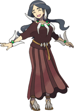
Now let’s turn our attention to Drasna’s outfit. Drasna is wearing a plain brown short-sleeved top distinguished by her various (and numerous) accessories. Said accessories include an enormous claw (or fang?) necklace with red and green stones, similar bracelets, and two enormous fang earrings. She also wears a belt, the clasps of which again resemble claws or fangs (or maybe teeth). Her hair is parted into two sections that flow behind her, almost like wings.
It seems reasonable to say that the upper portion of Drasna’s look is a visual mess; a design that, in its attempt to communicate her alignment with Dragon-types, goes overboard to an absurd extent. This is a parody of a fantasy character. I doubt that a comedic approach is what the character designers and Sugimori had in mind, which makes this even more odd, especially when you compare this to the more understated designs for Malva and Wikstrom. There are too many accessories on Drasna’s outfit; please eliminate three.
An Elite Four doesn’t necessarily require a unified visual or thematic principle, but Drasna feels brought in from an entirely different game, if not a wholly separate franchise. While the upper half of Drasna’s outfit is, well, overwhelmingly underwhelming, her skirt and shoes are substantially better. Drasna might be wearing an Edwardian gored skirt – which would be a great visual pun – but also brings to mind medieval women’s attire, especially when combined with her slender belt.
Drasna’s shoes are arguably the best part of her outfit. They have fangs or maybe claws for heels, and nod to draconic or prehistoric concepts without being too on the nose (and, in a way, remind me a bit of Alexander McQueen’s iconic ‘Armadillo boot’ from his spring/summer 2010 collection).
Ultimately, Drasna’s outfit has elements from several different historical periods mashed together, and not in a way that provides interesting contrast. (Compare this to Malva’s outfit, which successfully manages this sort of approach.) It feels like the designers couldn’t choose a single direction for Drasna’s look, and this was the result.
Rating: 2.5 out of 5.
Siebold

Siebold is a chef, and the rare Water-type expert whose character isn’t based around athleticism or physical strength. (Another example is the artist Wallace, who I wrote about in a previous article.) I always appreciate it when the designers find new takes on existing themes, and a chef who specializes in Water-type Pokemon is an inspired idea.
We don’t know much about Siebold, and like Wikstrom and Drasna, we don’t meet him in-game before the Elite Four. This is unfortunate, because Siebold fits right into the aesthetics-focused culture of the Kalos region – the player can’t enter certain cafes or restaurants unless they’re stylish enough. He could’ve easily made a cameo appearance as a celebrity chef in one of these establishments.
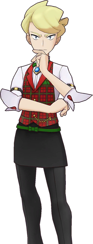
I really like Siebold’s outfit – it takes a chef’s jacket and apron as a starting point, then transforms those basic concepts into a more fanciful and interesting design. The ruffles on his sleeves and collar bring a medieval or even fantasy vibe that lines up with X and Y’s overall tone. We can tell that Siebold is a fussy and meticulous sort of person; everything is just so, apart from his harried expression and the askew ribbon around his neck. (It’s possible that he won this ribbon in a cooking competition.)
Pokemon series scenario writer Toshinobu Matsumiya revealed on Twitter that Siebold’s Japanese name, Zumi, and its reference to the Siebold crabapple are deliberate references to acidity in such cooking ingredients as sherry vinegar. This aligns with what we can ascertain of Siebold’s personality from his costume and character design. (Sherry vinegar is also the more luxurious version of balsamic vinegar, an added detail that emphasizes Siebold is a high-profile chef.) I do wish that the English version of the game had named Siebold similarly to many other versions, where he’s given the name Narcisse, after the Greek mythological figure Narcissus who fatally fell in love with his own reflection in a pool of water.
I could see the argument that Siebold’s look is a tad overdesigned, and I would be inclined to agree were it not for his stark and minimalist apron and pants, which provide necessary contrast for his more extravagant jacket. It makes sense that the upper half of his design would have more visual impact, because it’s what most people would typically see. There’s also something a bit gender-neutral or fashion-forward about his almost floor-length apron (which we’ll discuss further in a moment).

Siebold has a particularly great alternate outfit in the spinoff game Pokemon Masters EX. The look, released for Holidays 2019, is incredibly, remarkably detailed. He wears a festive red-and-green plaid blazer with a green pocket square, watch chain, and sleeve garters, all of which make for a delightfully luxurious (and perhaps somewhat impractical) outfit. (The overall effect reminds me a bit of Samuel West’s wardrobe in the 2020 All Creatures Great and Small remake.) He’s also wearing what seems like a black apron or skirt, accentuated with an artfully-askew green-bowed belt; as with his original apron, this feels more avant-garde or gender-neutral than the Pokemon series typically gets.
Rating: 5 out of 5.
There’s a lot to discuss about the Kalos Elite Four, moreso than I perhaps expected when I started writing this article. It’s interesting how this group of trainers showcase two diametrically-opposed approaches to character design. On the one hand, Malva and Siebold are very modern or even fashion-based. On the other, Wikstrom and Drasna resemble the fantasy-based designs that we often see in the Pokemon franchise.
Next time: We look at the Alola Elite Four, introduced in 2016’s Sun and Moon. See you then!
You must be logged in to post a comment.